
Àpèjúwe
ClassicAddons Content Blocks is a premium-quality, lightweight block library for the native WordPress editor. Build landing pages, marketing sections and sales pages with polished, conversion-focused blocks — without installing a heavy page builder and without touching a line of code.
Every block is server-rendered (dynamic PHP), ships zero frontend JavaScript, and only loads its own CSS on pages that actually use it. The result: clean markup, fast pages and great Core Web Vitals.
Why youÌtumọ̀ Yorùbá: ’ll love it
- ⚡ Fast & lightweight — no jQuery, no frontend JS, per-block CSS loaded on demand.
- 🎨 Genuinely designed — sensible defaults that look great out of the box, plus deep customization when you want it.
- 📱 Fully responsive — separate desktop / tablet / mobile controls for typography, padding and visibility.
- ♿ Accessible — semantic HTML, ARIA labels, keyboard-friendly controls and reduced-motion support.
- 🔍 SEO-friendly — selectable heading tags (H1–H6) and optional FAQ schema (JSON-LD).
- 🧩 Composable — cards drop straight into core Columns / Grid layouts and stretch to equal height.
- 🧱 Native editor — built on
block.json, the Block Supports API and standard hooks. Works with block themes and Full Site Editing.
The blocks
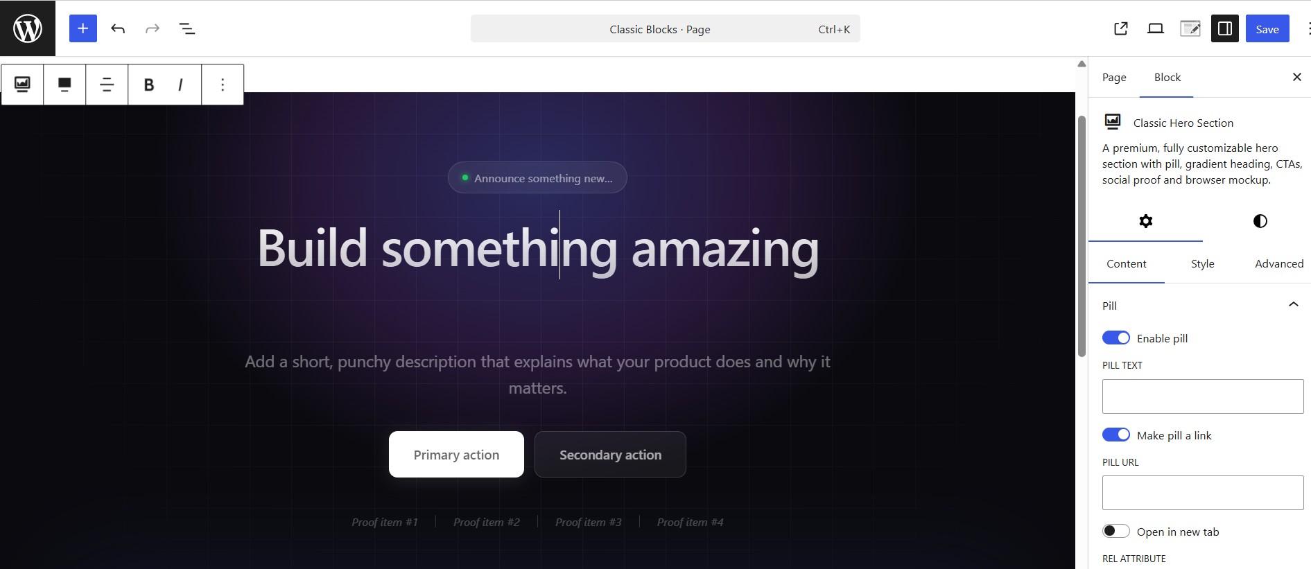
- Classic Hero Section — a fully customizable hero with pill, gradient heading, two CTAs, animated proof bar and a browser-mockup image.
- Classic Testimonial — a review card with quote, star rating, avatar and author details. Drop several into a Columns layout for a testimonial wall.
- Classic Team Member — a staff/profile card with photo, name, role, short bio and social links (X, Facebook, Instagram, LinkedIn, YouTube, website, email).
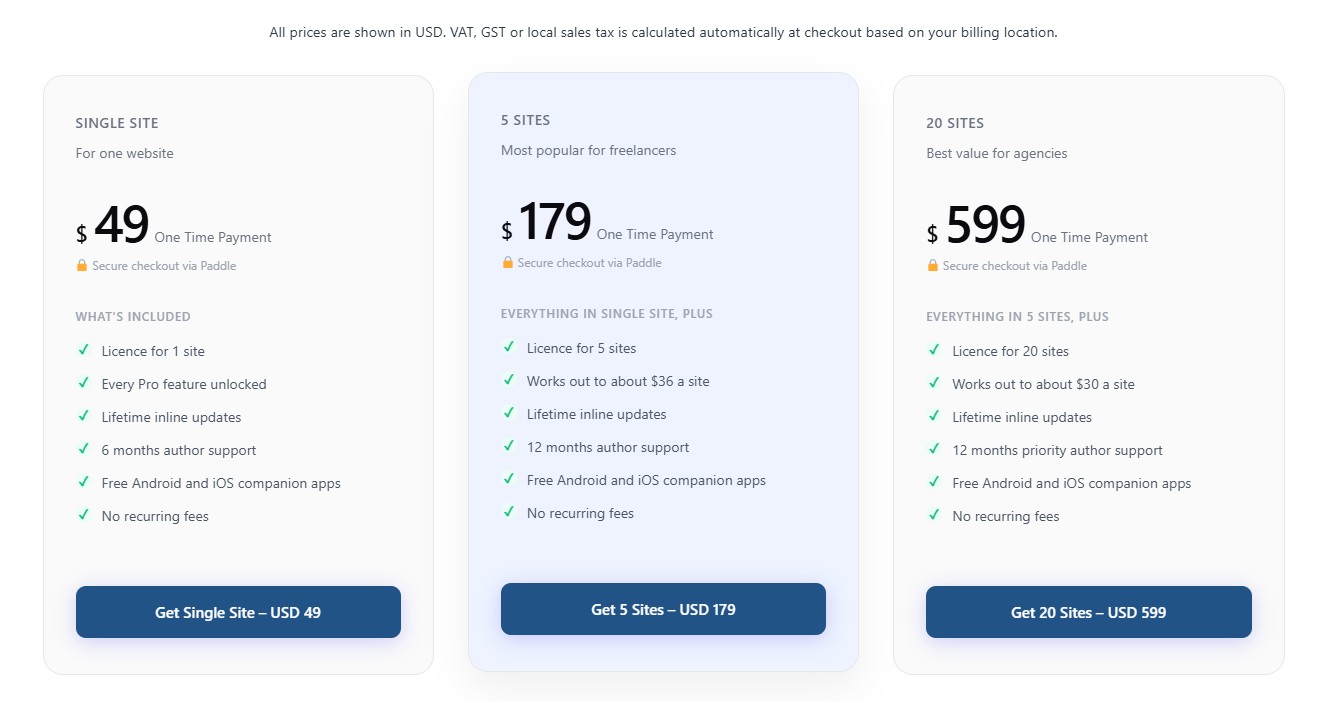
- Classic Pricing Box — a pricing plan card (name, price, features, badge, featured style) with a flexible CTA — a link or a JS button with custom id, classes and data-attributes (works with Paddle.js and similar).
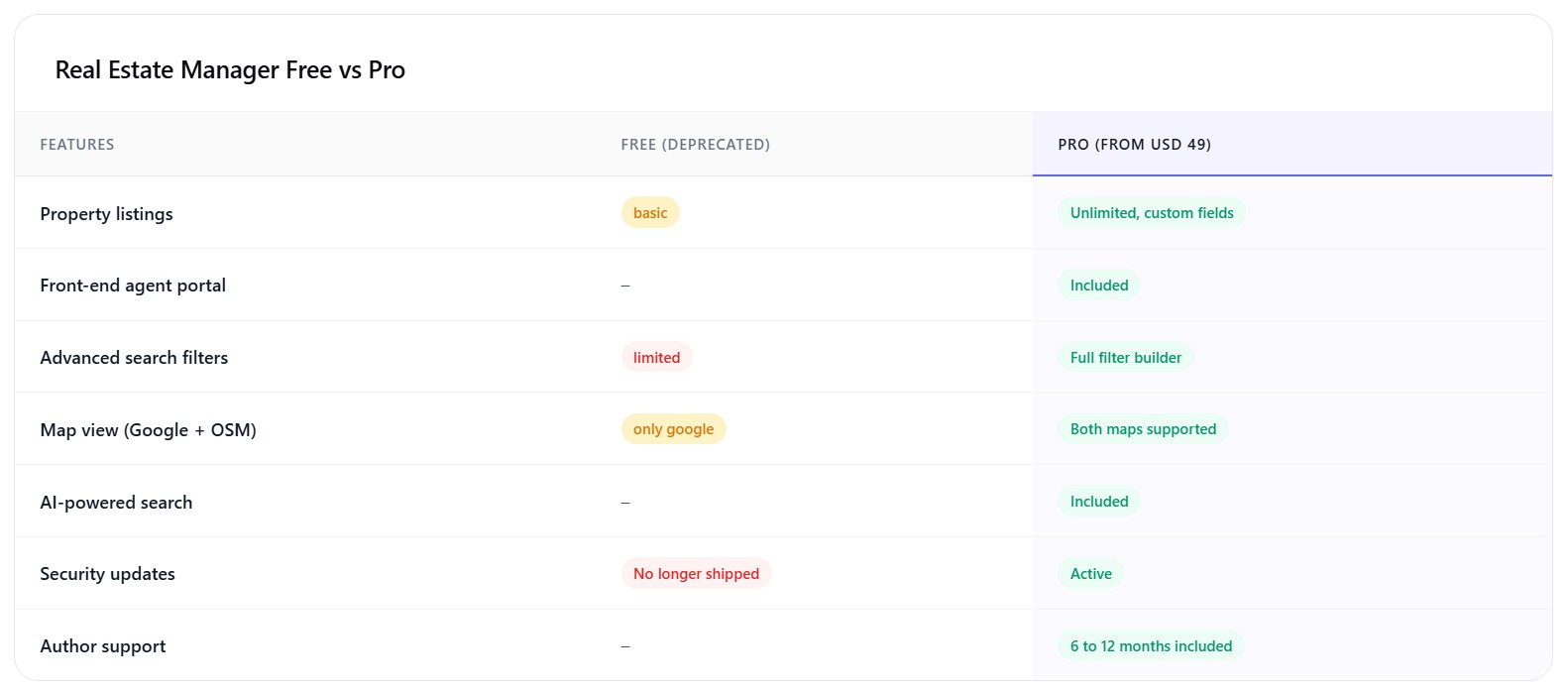
- Classic Comparison Table — feature-by-feature comparison with a highlighted column, good/bad/meh status pills and an optional in-card header and footnote.
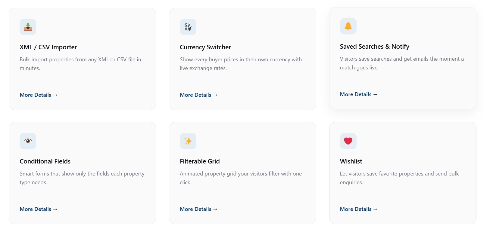
- Classic Info Box — feature card with an icon (dashicon / image / emoji / custom SVG), title, description, optional link and 5 style variations.
- Classic FAQ — an accessible accordion (native details/summary) with optional FAQPage JSON-LD schema for rich results.
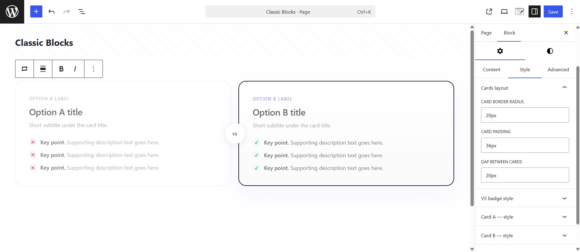
- Classic Versus Box — head-to-head two-card layout with an optional “VS” badge, custom item icons and ribbon badges.
- Classic Eyebrow — a small pill/label for section headers: alignment, optional link, icon (dashicon / image / emoji / SVG), colors, background, border and typography.
- Classic Section — a full-width container/row with background (color / gradient / image / overlay) and an adjustable inner content max-width. Drop any blocks inside.
Built for performance and quality
- Dynamic PHP rendering via render callbacks (lean, secure, cache-friendly).
- Frontend and editor assets are separated, and styles are enqueued the WordPress way (
wp_add_inline_style). - Block style variations (Light / Dark / Elevated and more) across most blocks.
- Reusable controls — typography, spacing, color, gradient, icon picker and a responsive helper.
- Follows the WordPress Coding Standards with full escaping, sanitization and i18n.
Source Code & Build Process
This plugin is fully open source (GPL-2.0-or-later). The complete, human-readable
source for every compiled asset is bundled inside the plugin in the /src
directory. The minified files in /build are generated from /src using the
official @wordpress/scripts toolchain (webpack under the hood) — no other build
tools are required.
To regenerate the compiled assets from source:
npm install— installs the build dependencies declared inpackage.json.npm run build— compiles/srcinto/build.
Use npm start for a watched development build. There is no obfuscation; the
build step only bundles and minifies the JavaScript and SCSS that ships in /src.
Àwọn àwòrán ìbòjú
Àwọn ìdí
Plugin yìí pèsè 10 àwọn ìdí.
- Classic Hero Section A premium, fully customizable hero section with pill, gradient heading, CTAs, social proof and browser mockup.
- Classic Team Member A team / staff profile card with photo, name, role, short bio and social links. Composable — drop several into a Columns or Grid layout.
- Classic Versus Box Two-card head-to-head comparison with optional VS badge, recommended ribbon and checklists. Compose it inside a Classic Section.
- Classic Section A full-width section/container with background controls and an adjustable inner content max-width. Drop columns, info boxes or any blocks inside.
- Classic Info Box A polished feature/info card with an icon, image or emoji, customizable title, description and optional link.
- Classic Eyebrow A small pill/label (eyebrow) for section headers, with alignment, optional link, icon, colors, background and typography controls.
- Classic Pricing Box A single pricing plan card — name, price, features, badge and a flexible CTA (link or JS button with custom data-attributes). Drop several into a Columns or Grid layout.
- Classic Comparison Table Feature-by-feature comparison table with highlighted column, status pills and an optional table header and footnote. Compose it inside a Classic Section.
- Classic FAQ An accessible accordion FAQ list (native details/summary) with optional FAQPage schema. No heading or section chrome — compose it inside a Classic Section.
- Classic Testimonial A single testimonial / review card with quote, star rating, avatar and author details. Composable — drop several into a Columns or Grid layout.
Ìgbéwọlẹ̀
- In your WordPress admin go to Plugins Add New, search for “ClassicAddons Content Blocks”, then click Install and Activate. (Or upload the
classicaddons-content-blocksfolder to/wp-content/plugins/.) - Open any page or post in the block editor.
- Click the + inserter and search for a block name (e.g. “Testimonial”) or browse the ClassicAddons category.
- Add the block and customize it from the Content / Style / Advanced inspector tabs.
If you install from source, run npm install && npm run build inside the plugin directory first (see below).
FAQ
-
Do I need a page builder to use these blocks?
-
No. Everything runs inside the native WordPress block editor. There is no separate builder, canvas or lock-in — just standard blocks.
-
Will this slow down my site?
-
No. Blocks render on the server with no frontend JavaScript, and each blockÌtumọ̀ Yorùbá: ’s CSS is only loaded on pages where the block is used.
-
Is it compatible with Full Site Editing (FSE) and block themes?
-
Yes. The blocks use
block.json, the Block Supports API and standard WordPress hooks, so they work in the post editor and the Site Editor. -
Can I build a testimonials or team grid?
-
Yes. The Testimonial and Team Member blocks are composable — add a core Columns or Grid block and drop several inside. Cards stretch to equal height automatically.
-
X (Twitter), Facebook, Instagram, LinkedIn, YouTube, a generic website link and email.
-
Can I change the heading tag for SEO?
-
Yes — heading tags are selectable (H1 through H6, or div) so you keep a correct document outline.
-
Does it work with my themeÌtumọ̀ Yorùbá: ’s colors?
-
Yes. Color and gradient pickers inherit your active theme palette, and you can always set custom values.
-
Is the plugin translation ready?
-
Yes. All strings are internationalized and a translation template (
.pot) is included.
Àwọn àgbéyẹ̀wò
Kò sí àwọn àgbéyẹ̀wò fún plugin yìí.
Àwọn Olùkópa & Olùgbéejáde
“ClassicAddons Content Blocks” jẹ́ ètò ìṣàmúlò orísun ṣíṣí sílẹ̀. Àwọn ènìyàn wọ̀nyí ti ṣe ìkópa sí plugin yìí.
Àwọn Olùkópa
Túmọ̀ “ClassicAddons Content Blocks” sí èdè rẹ.
Ṣe o nífẹ̀ẹ́ sí ìdàgbàsókè?
Ṣàwárí koodu, ṣàyẹ̀wò ibi ìpamọ́ SVN, tàbí ṣe àgbékalẹ̀ sí àkọsílẹ̀ ìdàgbàsókè nípasẹ̀ RSS.
Àkọsílẹ̀ àwọn àyípadà
1.2
- New block: Classic Testimonial — review card with quote, star rating, avatar and author details, plus Light/Dark/Elevated styles.
- New block: Classic Team Member — profile card with photo, name, role, bio and SVG social links (rounded / circle / square icons), photo-top / photo-left / full-width cover layouts, and Light/Dark/Elevated styles.
- Icons: Dashicons now load correctly on the front end; Eyebrow and Hero pill gained image / emoji / custom SVG icon sources.
- Hero: added a “Make pill a link” toggle and a default H1 heading.
- Comparison Table: removed columns no longer reappear on the front end.
- Info Box & Team Member: inline links now work in body text on the front end.
- Inline block CSS is now enqueued via
wp_add_inline_style()instead of inline style tags.
1.0.0
- Initial release with eight blocks: Classic Section, Classic Hero Section, Classic Eyebrow, Classic Versus Box, Classic Comparison Table, Classic Info Box, Classic FAQ and Classic Pricing Box.
- Reusable component library (typography, spacing, responsive, color, gradient, icon picker).
- Block style variations across most blocks.
- Optional FAQPage (JSON-LD) structured data on the FAQ block.
- PHP 8+ namespaced architecture, autoloader, extensible block registry.